Look around everywhere and it is impossible not to notice something branded iSomething or another. Whether iPod, iPhone, iMac, iTV or iDrive, the proliferation of all things “i” is immense.
Five short years ago BMW hit the market with iDrive, a new driver interface meant to do away with dashboard clutter and make the driving experience better. Car magazines as a whole were very negative towards the new technology and filled page upon page bashing the new system as a disaster. Open editorials were made to BMW begging them not to ruin the 5-Series and 3-Series with this device. BMW conceded in a small way by making the iDrive optional on the 3-Series when it was introduced in 2006, however the iDrive was standard on the 5-Series when that came online in 2004.
A funny thing happened along the way however with the iDrive, other manufacturers debuted their own version of the iDrive. Audi has the MMI, Mercedes-Benz offers the Command system, and Acura has the Multi-Information Display (which is trickling into Honda as well).
BMW is now getting ready to introduce the next generation of iDrive shown here:
www.autospies.com/news/Exclusive-Photo-The-new-iDrive-in-the-5-Series-29432/
From a personal level, I SWORE I would never drive an iDrive or similarly equipped car.
Period, end of discussion.
And then my wife asked for and got the 2006 Audi A6 4.2 with MMI. This centrally located dial controls most functions of the car, although redundant HVAC controls adorn the dash as well. And, for the most part it isn’t that difficult to operate if you spend a few minutes learning the basics.
Widely praised by the auto magazines, the MMI took the iDrive concept and made it better.
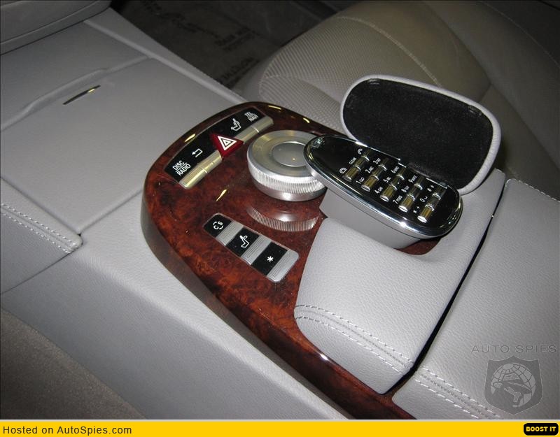
And Mercedes-Benz shortly followed suit with the Command system first seen in the new S-Class. This design is infiltrating the rest of the lineup, although it is still optional on the newly released C-Class.
And Acura, although not placing the knob in between the seats like the others but rather on the dash itself, has allowed a central dial to control multiple functions thereby freeing up an otherwise button cluttered dashboard.
So the question is this, (and I know all you BMW haters will jump on this like crows on road kill) like the Bangle Butt of the 7-Series, did BMW revolutionize the industry with the iDrive technology and design?
A few ground rules here in discussion, if you haven’t driven ANY of the systems, your opinion is purely speculative at best. I come to the table having used the iDrive, the MMI and Acura’s Multi-Information Display systems over extended periods of time. (2 of the 3 systems because I own cars equipped with them)
The Audi MMI system is a semi-redundant system as there are 4 buttons that act as additional aids in the use of the system. Certain tasks like changing radio stations are easy to achieve, however a task as simple as changing the date and time can frustrate as those functions are buried in a maze of menus. A button labeled “return” takes you back to the previous screen you were on, so navigating the numerous menus is made a little easier. One nice feature on the A6 is the volume control for the radio situated right next to the MMI that falls readily to hand without any need to look away from the road.
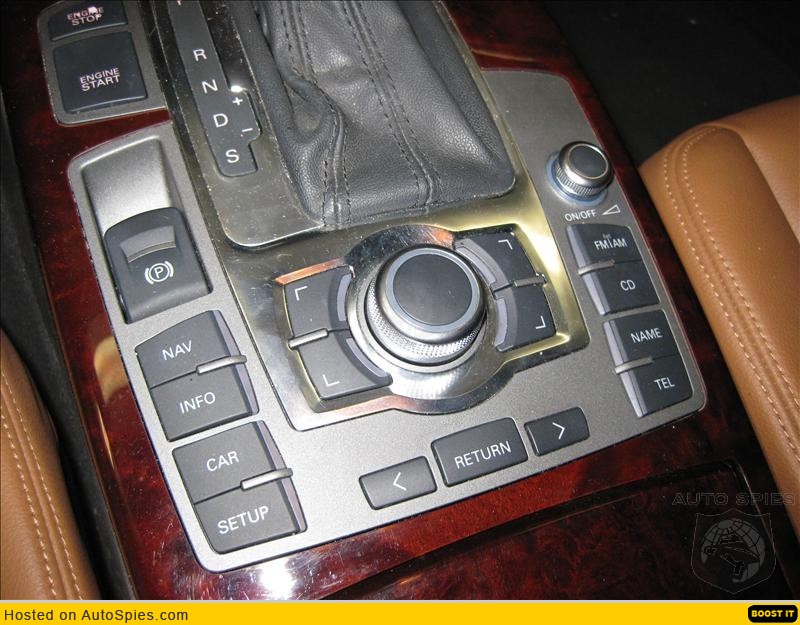
Trying to enter an address into the navigation unit however is a task that one should devote time to however, as the system is not all the intuitive to begin with, and the unit is very particular in the naming of the streets and cities, and leads to a lot of frustrating as you scroll through the alphabet to spell out where you are going only to have the system say no such address or city or number exists. Part of the deficiency here is the software itself, but it leads to a frustrating experience especially when you are trying to program the system while driving.
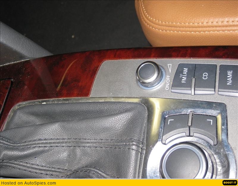
Not all Audis however have the MMI in between the seats however; the TT in particular has the control on the dashboard. I have not driven an Audi set up this way, so I will withhold opinion on that setup, but can address it somewhat based on time spent in an Acura RL.
Last year while on vacation in Southern California, I spent a week driving the 2007 Acura RL. Forget the fact that the car drove like the 2004 Accord I owned, the Multi-Information Display system is the subject at hand. It took me almost 2 days to simply get my Bluetooth equipped phone to sync with the system, and half that time was spent navigating the menu system. I finally consulted the owner’s manual and even then could not get the phone to pair with the car. This multi use knob sits just out of the normal grasp of drivers, and as such using it was distracting and frustrating. The menu system on the surface appeared to be simple but within the sub-categories some frustration was incurred, as things weren’t as simple as they appeared. The fact that the knob required extension of your arm to reach and fiddle with did not score highly with me. I was glad to give the RL back after the week.
Which brings up the BMW iDrive. I have spent extended periods in the 5-Series equipped with iDrive and now my own iDrive equipped M3, however I have not driven the 7-Series at all so my comments don’t cover that car.
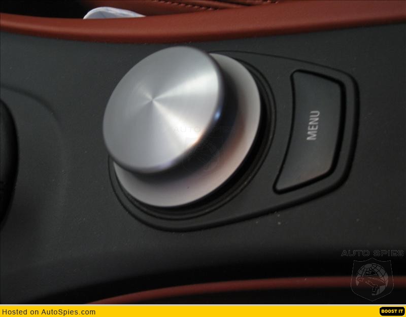
My biggest criticism of the iDrive is simply this, and it concerns the 5-Series in particular, what is the point if the car is not equipped with Navigation? Now granted the Audi system is available even if navigation is not ordered as well, but as a whole why place the large screen there if Navigation is not there as well.
By making the iDrive optional on the 3-Series and 1-Series as part of the navigation unit I think the system makes pretty good sense. Although I swore I would never have the system myself, I have now spent 2 months driving with it everyday, and it really isn’t that bad. For me personally I was sold on it in the M3 when I saw how you could control your iPod. The iDrive display is laid out similar to the screen on your iPod allowing you to quickly find the music, artist or play list you want to listen too, much like the touch wheel on the iPod itself.
I am not much of an owner’s manual kind of person, so when it came time to enter an address I went it alone, and honestly it was simple. The entire process was accomplished while I was driving, and the system did a good job of “thinking” for me as the information was entered into the system. I told my wife how easy it was compared to the Audi, and she tried it as well and agreed.
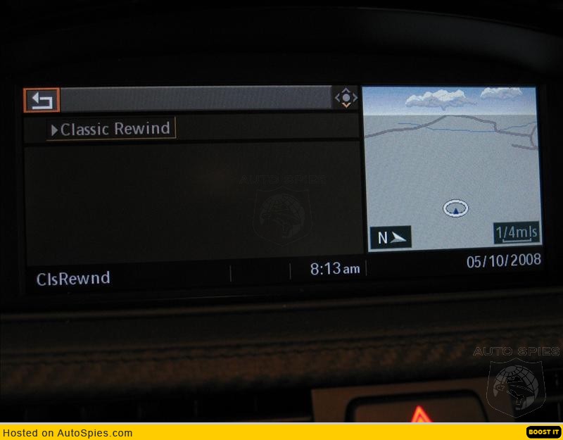
The best feature of the system is the ability to split the screen and have information from 2 different sources displayed at the same time. With the Acura and Audi systems, if you wanted HVAC info, that is what is displayed, want navigation, you got it but nothing else. With the BMW you can display navigation on 1 portion of the screen, and have your iPod play list on the other portion and to move between the 2 sections require nothing more than a simple nudge of the iDrive controller.
As stated earlier, I have not tried the Command system in Mercedes-Benz; perhaps some of you out there who do have this system can offer some comments. If you have another system to do your own comparison to that would be great.
But it does bring us full circle, BMW introduced the first single controller design, and others followed suit. Is it fair to say that BMW revolutionized the industry with the iDrive technology and design?