The Antithesis of Clean Design
Cadillac went for a streamlined look with its latest Escalade, the head lights flow into a side profile with subtle fenders and devoid of any unnecessary fender vents. The design works as intended until you get to the second row window that is bisected by dividers and plastic space fillers. On a spotless profile the window sticks out as out of place. Engineering logistics certainly dictate what designers can do with the window but the last generation Escalade was able to keep the glass completely clear of any obstructions. On the other hand, Cadillac's competitor Land Rover was able to do an excellent job cleaning up the side profile on its latest Range Rover Sport model.
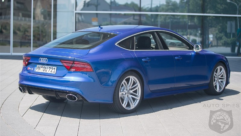
It's not always possible to keep the rear window as a single piece of glass but when it's done like on the Audi A7 or the divider is kept to a minimum as on the Tesla the result is stunning.
Do you have a pet peeve design element that you wish to rip off a car yourself?
Read Article
Copyright 2026 AutoSpies.com, LLC