Before I get into the meat of this story I need to disclaim if you work or ever worked for Apple like I did, it's pretty much a GIVEN, you're a typeface slut.
In my case back in the late 80's I was one of the big sales guns at Apple in the world of Desktop Publishing, Printing, Multimedia and Video. And to live in that world, you needed to know WAY too much about fonts/typefaces. Kerning, letter spacing, tracking, on and on.
To this day i can see something and instantly know if it's Optima or Trade Gothic (Auto Spies font) or Bernhard Modern, etc. It's in my DNA at this point.
So that's probably why I'm the ONLY one in the major car media that has noticed this subtle Porsche ripoff by KIA.
WHAT am I talking about?
Well, have you seen the badging on the new KIA Carnival?

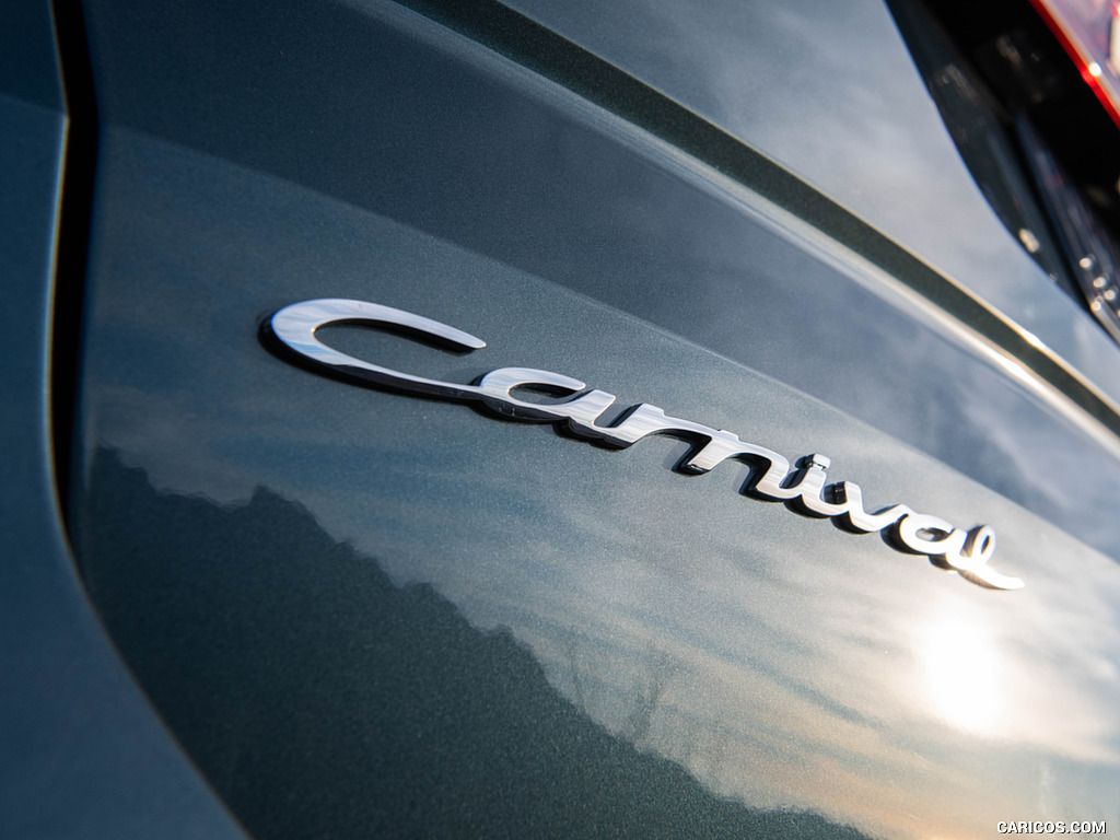
Look FAMILIAR?
If not, let us help you out...and yes, there are 'subtle' differences but C'MON MAN?!
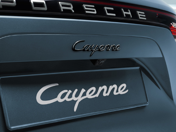
That naughty little Peter Schreyer!
So is KIA trying to send a subliminal message that the Carnival is a CAYENNE for Soccer moms/dads?
And should the brass at Porsche be HOT over this?
Discuss...