In a move that has the EV world buzzing, Lucid Motors appears to have quietly rolled out a bold new visual identity. Early leaks suggest the redesign is meant to signal a fresh chapter for the struggling luxury electric vehicle maker, something sleek, modern, and supposedly reflective of the brand’s ambitious trajectory. Industry watchers are already dissecting every pixel, wondering what message the company is trying to send after years of delayed deliveries, production headaches, and investor skepticism.
This might as well be it after their miserable performance. The chart above looks less like a corporate emblem and more like a perfect visual summary of Lucid’s stock price: a hopeful climb, a few optimistic green spikes, then a long, merciless red freefall that ends face-down in the dirt. The steep vertical plunge on the right side is basically the brand’s official forecast—sharp, dramatic, and heading nowhere good.
AND HERE IT IS!!!!!
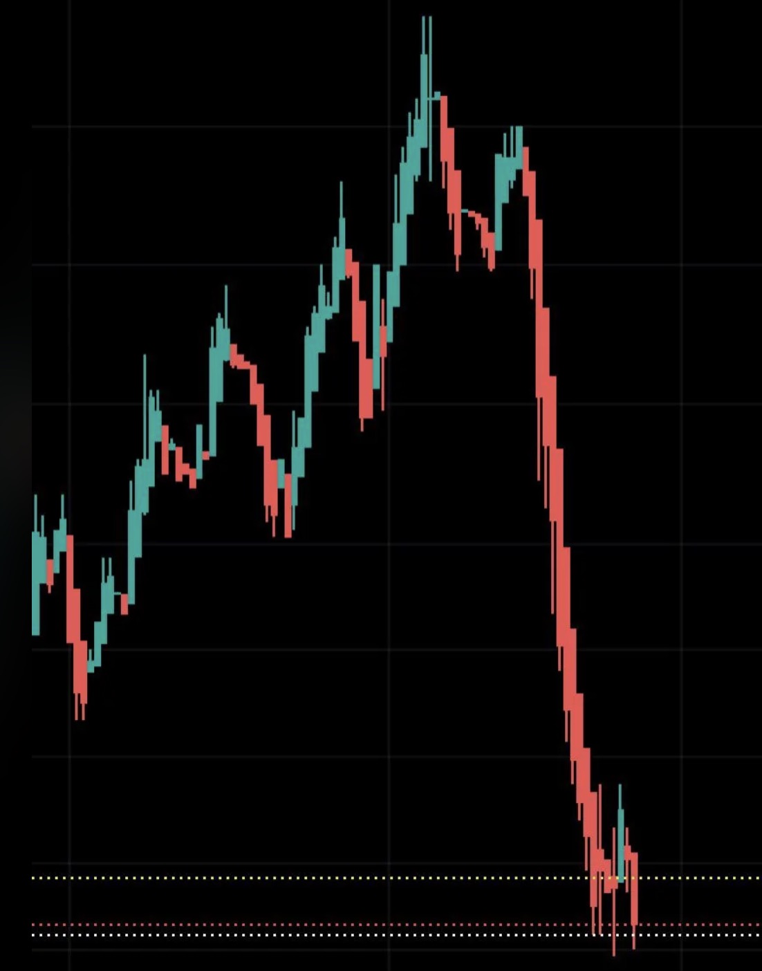
Lucid’s once-hyped Air sedan and Gravity SUV were supposed to rewrite the rules of electric luxury. Instead, the company has spent years promising volume it can’t deliver, burning cash at an alarming rate, and watching its valuation evaporate. The chart’s final free-fall isn’t just technical analysis; it’s a portrait of missed targets, fading hype, and a future that looks increasingly like a long, lonely descent. While competitors keep moving forward, Lucid’s trajectory is pure gravity—straight down. This isn't their new logo, we were being sarcastic. But you must admit, if they WERE doing a new one, at least it would be honest.
And can you believe how many idiot reviewers are trying to PUSH the Gravity?
PREDICT its chances for success. Only answers of .0000001% or less will be accepted.